Illustration notes: Should you note or not?
Whether or not you should add illustration notes to your picture book manuscript is always a hot topic. Picture books are a collaboration between author and illustrator, and authors often want to make sure their vision for the book is communicated through small notes left in the text.
These notes can explain specifics not described by the text, hint at things happening in the background, or indicate a visual joke needed to make the plot work. The main thing to remember is, you have to leave room for the illustrator to bring their vision to the project. You’re basically writing half a book, and handing it over to someone else to bring it to life.
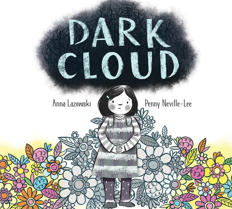
I’m a fan of illustration notes, but try to use them only as needed. The final DARK CLOUD manuscript my editor at Kids Can Press sent to illustrator Penny Neville-Lee had five of them.
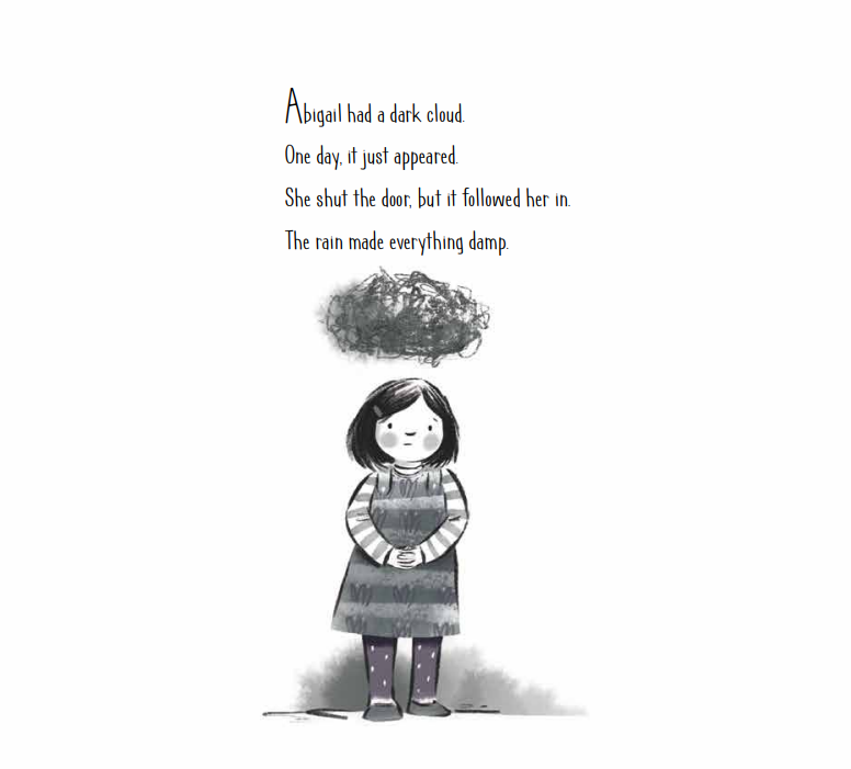
The book follows Abigail, a young girl who begins to experience depression. The first note, and to me, the most important one was right at the top. It said, “Over the course of the spreads, small elements of light/brightness slowly start creeping into the images.”
In my head, I was imagining mostly greyscale at the beginning and the book would get more colourful as it went along. But the note didn’t explicitly say that. This is what the first page of the book looks like:
When I asked Penny about her overall vision for DARK CLOUD, she recalled a Zoom meeting with the editor and art director where she nervously proposed the idea of mostly greyscale — not realizing we had imagined it the same way.
There were also two small notes to indicate the need for a visual of parental support, so readers wouldn’t feel like Abigail was dealing with things on her own. For example, since her mom isn’t specifically mentioned in the text, the need for her presence was indicated in a note.
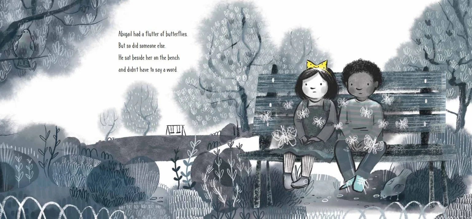
Two final notes were tied to Abigail’s interactions with a friend. The first one read, “Abigail sits beside a little boy on a bench at recess. Together, but still alone, a hint that she’s not the only one. Each has a striking swarm of their own colourful butterflies.” Here’s how that page turned out:
As you can see, Penny did most of the things that were in the note, but the butterflies aren’t in colour.
Penny said, “There was some back and forth about not making the butterflies colourful as suggested so that smaller elements like the bow would have more impact.”
She knew, visually, it was too early in the book for that colourful element to happen. So she shifted focus to the bow in Abigail’s hair, which was given to her earlier in the story by her dad.
The final note was for the last spread in the book, it said, “Abigail and little boy from spread 5 are swinging beside each other, their butterflies are still present, but they’re happier.”
Since the author and illustrator generally don’t communicate while the art is in progress, I understand why authors sometimes clutter their manuscripts with illustration notes, and why many editors strip them out.
I asked Penny how she feels about art notes in general, she said they’re useful to a point. “With fiction there's usually a very clear descriptive passage to be illustrated. With picture books it's far more open ended. If the author or designer has strong feelings, it's worth knowing so you can take on board. The notes for Dark Cloud were perfect. I could see the book unfurling as I familiarised myself with your text. Spreads like the library one arrived nearly fully formed. Others like the fractured dream took some more thought. Getting the pacing right is tricky and takes a lot of planning through thumbnails and roughs. Too many notes can shut that process down!”
It’s about finding that balance, so the author’s vision for the book is enhanced by the ideas the illustrator brings. For me, seeing someone else’s interpretation of the words I wrote is the best part of writing picture books. Sometimes that means letting go of those notes and seeing where the inspiration takes them.


